
Bell Curve Distribution Cartoon Meme Background
Part of Cartoon Meme
Bell Curve Distribution Cartoon Meme Background
Part of Cartoon Meme
Get this stock image & more with:

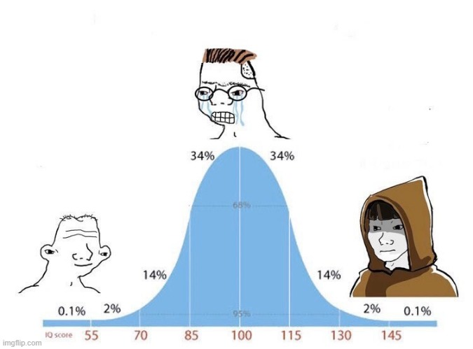
This cartoon meme-style background shows a bell curve distribution chart with illustrated characters placed along the curve and at the tails. The graphic has a playful, educational look that works well for statistics jokes, classroom content, and reaction-style posts. Open it in piZap and use it as a base for a meme, add a headline, or build a layered collage with text and stickers. It can also support quick social graphics when you want a humorous way to present data or explain a concept. If you’re browsing for more options, explore stock backgrounds in piZap to find layouts that fit different themes, from school projects to lighthearted office content. The simple chart structure leaves space for custom edits, making it easy to adapt for posts, cards, or visual presentations.
More like this
See all


Get this stock image & more with:
Keywords
bell curve distribution background, cartoon meme background, statistics meme graphic, educational cartoon background, funny data chart, social post background, visual layout background, cartoon meme